
Sprint Mode in Two Time Zones: UX Across a Cultural and Technical Divide
Challenging Assumptions from Within
“My team said that the new site looks like a site for foreigners,” said Yaeko, the stakeholder based in Japan, on the pre-launch of her new RFP site. This was not the first thing I wanted to hear, after a 7-day, round-the-clock sprint job. My response came out quicker than expected — but not unhappily: “Yes, and that is a good thing.”
Before UX, I was a pretty good all-round graphic designer — perhaps somewhat of a primadonna. And before that, I was in Fashion Design, where the highlight of my career was working for Helmut Lang in Japan, coming up with concepts to launch their avant-garde minimalist line to prominent missy department stores nationwide. It was there that I learned I was more of a graphic designer than a fashion designer — and that I was never, and can never be, thin enough. This was the noughties. And this was when I realized I had too much of an opinion. That’s just it. A person who challenges convention often finds themself in a difficult position — especially without evidence to support the challenge.
Through UX, I can now back my perspective with method.
So when it came time to create my stakeholder’s RFP site, I created this UX decision framework to map the constraints, goals, and choices made to modernize Yaeko’s legacy site and transform it into something that would work for her international audience. Given that she was pitching AMAN Hotel for an installation project, we landed on our direction based on the UX design decisions outlined in the chart. Just one thing remained — the central challenge: preserving authenticity while meeting usability expectations that were aligned with AMAN’s brand ethos and future scalability.
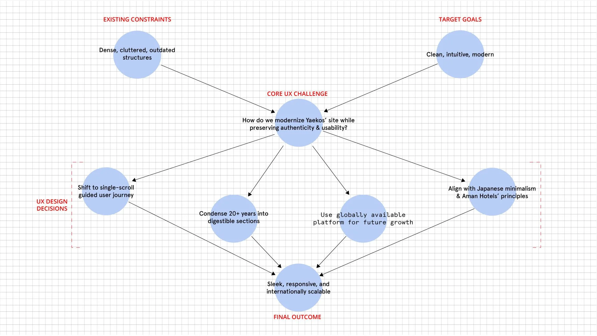
This UX decision framework worked handidly for this quick turaround project.
But quickly — what is an RFP site?
Though the name may sound bespoke, the RFP site is essentially a single-scroll website with a specific goal: to respond to a request for proposal. I developed this approach as a highly customizable design solution that blends narrative structure with strategic intent. Unlike salesy landing pages, an RFP site is concept-driven and tailored to the subject matter at hand. It tells a focused story, highlights relevant strengths, skills, and accomplishments, and ends with a clear call to action. In short, it functions as a case-aware microsite — designed to engage, persuade, and convert within the context of a specific opportunity.
Simply put, it’s a one-pager, single-scroll website that tells the entire story of [insert topic] from A to Z, culminating in a CTA. The goal of this site is to keep the user engaged from start to finish — leading them to the big picture: a win for the stakeholder.
A Cultural Design Dilemma
Japanese design and art aesthetics have long been regarded among the most elevated in the world, websites in Japan have been stuck in a sort of limbo — 1998 to 2002 era web design style.[1] Sesshū’s[2] ability to capture stillness and tranquility, distilled to absolute simplicity, is in line with inhabiting ohmness in Zen. At the same time, Murakami’s[3] boldness to call on absurdity to create whimsical characters — juxtaposed with established legacy brands — is par to none. And Eiko Ishioka’s[4] unparalleled skill to create dynamic imagery that transcends cultural landscapes while unfurling singularly astonishing visuals cannot go unrecognized as anything less than genius.
To summarize: Despite Japan’s strong legacy in art and visual culture, web design — especially among legacy stakeholders — has remained resistant to modernization. Though improvements are underway, it’s still a far cry from global UX standards.[5]
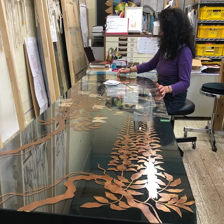
Yaeko creating one of her many masterpieces in her studio in old Edo
Path Dependence and The Gap That Ensued
So when Yaeko came back with her comment about the new site appearing “like a foreigners’ site” — i.e., too Western — I recognized the friction of a cultural feedback loop shaped by path dependence. A cultural feedback loop refers to the internal reinforcement of design expectations informed by local norms — where what’s familiar becomes a default, not because it’s optimal, but because it has been repeatedly validated through exposure and repetition.
In this case, the historically dense and text-heavy structure common to many Japanese websites had come to represent “professionalism” and “completeness” for her and her team. Any departure from that model — especially one aligned with minimalist Western UX practices — felt not just unfamiliar, but misaligned. Her response was a textbook example of how culturally habituated design patterns and historical inertia compound resistance to change, even when that change is rooted in strategic intent.
The streamlined new site — absent of clutter and full of white space — was completely alien to what she was used to. Gone were the multi-tiered navigation menus, pages overcrowded with dense text, and unclear visual hierarchy. We replaced disorganized structure with intentional layout, and removed decorative elements that added no semantic or navigational value. The new site presented a coherent narrative rather than a fragmented collection of unrelated parts.
This, a case of what I’ve come to call delayed cognitive resonance — though she’d signed off on the working comps at every step — meant the design didn’t truly click until the site went live. It echoed the classic phrase I’ve heard from clients over the years: “I’ll know it when I see it.” In this case, “seeing it” didn’t mean previewing a functioning version, despite having been built directly on the platform— it meant encountering the design at its final destination, fully contextualized and real.
To ease her mind, I reassured her that this shift in experience was intentional (as all good things in UX are). I had aligned her RFP site for the specific audience it was meant to serve. Working from a rapid evaluation of AMAN Resorts’ brand ethos — minimalist luxury, quiet elegance, and highly curated experiences — through design choices like visual restraint, considered spacing, and refined hierarchy — we built the site to communicate clearly to that cohort. A quick market comparison and heuristic audit of peer organizations helped confirm we were designing in the right direction. In this way, we positioned the site to work with her potential client, not against them. And I reminded her this was not an overhaul of her legacy website, but a separate site — a purpose-built, single-scroll experience designed to respond to a request for proposal. Nothing more, nothing less.
In hindsight, I see how mental model misalignment[7] played a role. Her mental model saw both sites as the same thing — public-facing websites. But the RFP site was designed with a specific Western professional audience in mind, while her legacy site served a broader Japanese base.
Had we had more than a week, I would have spent more time guiding the stakeholder toward full comprehension of what we were developing. I recognize now that while I’m accustomed to working in sprint mode, that speed often leaves behind those unfamiliar with digital products or design thinking.
Sometimes, questioning entrenched thinking in UX doesn’t require dramatic interventions — it can mean patiently guiding a stakeholder out of the dense forest of outdated assumptions.
The Turnaround — and the Oversight
As it goes, things have a way of turning themselves around. One of the things I’ve struggled with all my life is having patience. As William Langland wrote in his 14th-century Piers Plowman poem:
“Patience is a virtue, possess it if you can, seldom found in woman, never found in man.”
Not 24 hours later, I got a call from the stakeholder who sounded surprisingly elated. After receiving negative feedback from her staff in Japan and others, she later received feedback internationally — where the response was overwhelmingly positive.
I was surprised — but not entirely. This was the validation she needed. Not from me, but from voices that aligned with her worldview. Especially those from other artists she respected, who said things like:
“Yaeko! What a beautiful site you made.”
“This perfectly encapsulates your essence.”
Or, my favorite, from her Michigan-born boyfriend: “This is great!”
Given her 180º turnaround, I noted that this was an example of confirmation bias. Confirmation bias, one of the first principles I learned, is the tendency to favor information that confirms existing beliefs or expectations; while downplaying or ignoring evidence that contradicts them. It was evident that her shift in perception required external validation from sources she trusted. The design itself had not changed; only the voices affirming it.
However, this experience also highlights a more significant issue: the absence of user testing. Testing the site with unbiased subjects is a critical part of proper UX methodology.
Hindsight is 20/20. I should have tested the site before launch. But given the timeline, it wasn’t feasible. At some point, the excuses have to stop.
That point is now.
Timeline or not, I overlooked a critical checkpoint in the process. Specifically, I deprioritized user testing and stakeholder onboarding during a compressed development window, which resulted in misaligned expectations at launch.
Working in sprint mode often creates a perfect storm for overconfidence bias; where speed, certainty, and stakeholder pressure converge into the false belief that validation can wait.
In reality, skipping user testing meant we were designing in a vacuum, trusting our instincts over real user insight. Ultimately, my job was to test the site and report back the findings. But in the rush to meet deadlines, in the harriedness of balancing US and Japan timelines, and in my own shortcomings keeping my eye on the prize, I lost sight of the real goal. The stakeholder.
Designing Inward
The project succeeded. The site performed. The stakeholder adopted it fully. But that’s not the most important outcome.
What stayed with me wasn’t just the launch, it was the gap. The quiet moment after delivery when I realized that user testing wasn’t just a procedural checkbox. It was the thing that could have made the stakeholder’s journey easier, the launch more fluid, and my own judgment more informed.
I offer this takeaway: We talk about user insight, stakeholder empathy, and designing with intention. But how often do we turn those same tools inward?
In many ways, I did. I drew on every facet of my UX training to align the project to its audience, to manage a high-stakes sprint, to guide a hesitant stakeholder toward clarity. I employed research heuristics, crafted a platform-native prototype, and delivered a final product that exceeded expectations. But what I neglected, what I chose to de-prioritize under pressure, was the very discipline I advocate for most: listening to users.
In hindsight, the failure wasn’t technical or aesthetic. It was a momentary lapse in applying the same rigor of empathy inward, toward my own decision-making. I treated experience as a substitute for evidence. And in that gap, I missed a checkpoint that could’ve changed the trajectory of the stakeholder’s experience, and my own.
Meaningful UX change isn’t loud. It’s slow, deliberate, and grounded in asking better questions, not just delivering faster answers.
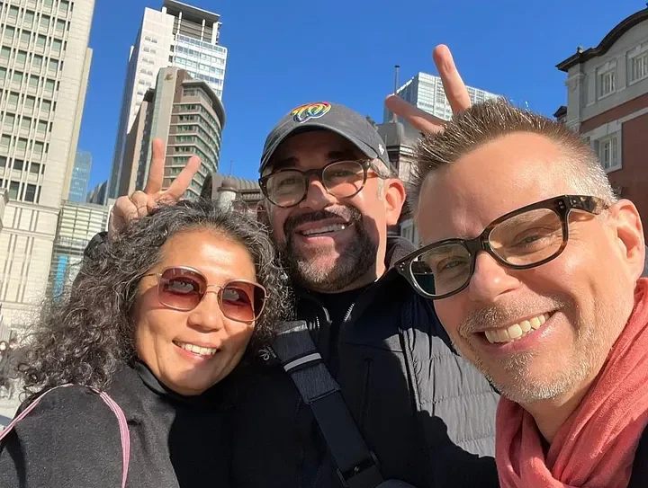
Yaeko, myself and Brian, her BF
Glossary of UX & Behavioral Principles
Path Dependence The tendency to follow historical patterns or decisions, even if they’re no longer effective. Once a path is chosen, it becomes harder to break away from it.
Delayed Cognitive Resonance (coined) A term coined to describe the perceptual and emotional delay stakeholders may experience when evaluating design. Even when exposed to working prototypes or live comps, the full impact of a design may not register until it is fully launched and contextualized. This mirrors the classic phrase, “I’ll know it when I see it,” and reflects a gap between abstract approval and embodied comprehension. When a stakeholder doesn’t emotionally or cognitively connect with a design until it’s live, despite having seen it in earlier forms.
Mental Model Misalignment When a stakeholder’s or user’s understanding of how something works doesn’t match how it actually functions.
Confirmation Bias The tendency to favor feedback that aligns with existing beliefs or expectations, while ignoring or discounting feedback that doesn’t.
Overconfidence Bias The false belief that a design or decision will succeed without testing — usually due to speed, pressure, or perceived expertise.
Suggested Reading & Influences
Daniel Kahneman — Thinking, Fast and Slow A foundational book exploring how our brains process information through fast (intuitive) and slow (deliberate) thinking. Concepts like confirmation bias and overconfidence bias are introduced here with lasting impact on UX and behavioral science.
Don Norman — The Design of Everyday Things Essential reading for understanding mental models, usability, and why intuitive design matters. Norman’s work continues to influence the structure of user-centered design across disciplines.
Jacob Nielsen — Usability Heuristics Known for codifying the “10 usability heuristics,” Nielsen’s principles offer practical guidelines for evaluating interfaces and identifying where mental models or assumptions break down.
(These sources have shaped many of the UX principles explored in this essay.)
References
Footnotes
David, Paul A. “Clio and the Economics of QWERTY.” The American Economic Review, vol. 75, no. 2, 1985, pp. 332–337. Or a UX-oriented primer: Path Dependence — UXmatters
Norman, Don. The Design of Everyday Things. Basic Books, 2013. See chapters on system vs. user mental models and discoverability.