When Your Client’s AI Slop Becomes the Creative Brief
There is a particular kind of image that we have learned to recognize almost instantly. It is glossy, over-rendered and impossibly polished, with typography that may be almost right and a composition that feels familiar without being particularly thoughtful. Everything has the appearance of having been assembled correctly, yet very little underneath it has actually been thoughtfully designed at all.
AI slop.
Designers know it when they see it, and we can usually identify everything wrong with it. We can explain why it lacks hierarchy, why the typography is questionable, why the imagery cannot be reproduced properly and why the composition ignores the constraints of the medium. We recognize that the asset probably cannot be edited and that what looks finished is often anything but. Most importantly, we recognize it for its slick, vapid execution that looks purpose-built at first glance but is ultimately interchangeable; change the headline and the same thing could be used for almost anything.
Then a client sends you that exactly and says, “I want this.”
Recently, a longtime client asked me to create a brochure. She sent me the copy and, shortly afterward, what was essentially a completed brochure created with AI. There was little mystery about its provenance: the PNG she sent me had “ChatGPT” in the filename. It was honestly a bit shocking, not in a way that felt insulting, but in the way that she had no shame in sending me slop that was, at best, sloppy work.
There was just one problem: it wasn’t really a brochure.
It was 9.34 by 12 inches, which was neither letter nor legal nor A4 nor A5 nor tabloid, nor any conventional paper size that made obvious sense for how the piece would actually be produced. Folded in half, it split content both vertically and horizontally. I knew this client, and I knew she wasn’t commissioning a custom print run. When the time came, she was going to have the file printed using readily available paper sizes and finishing options. So was this a brochure or a poster?
The AI didn’t know any of that. If the document had been sent to print as designed, the cover would have ended up on the back, text would have crossed the center fold, and content would have traveled from panel to panel, read right to left, and printed as though the brochure would always remain flat as it was on the screen. And if this WAS a brochure, even the page count had been assembled in increments of two rather than the four-page increments needed for the intended folded format.
Verbally, she had called it a brochure. Visually, it was a poster. I called it a posterchure.
In a traditional workflow, the designer’s instinct is to fight this , to explain everything wrong with it, propose alternative concepts, and educate the client about why any other approach would be better. But when a client hands you a completed visual asset they already love, I’ve learned after decades of the same issue with clients over and over that fighting the aesthetic is an inefficient use of my time. I realigned my purpose. She liked it, and the objective became simply, as the great Tim Gunn always says, to “make it work.”
I reconstructed the entire document from beginning to end at a conventional size she could actually print. The copy in the AI version didn’t match the document she had originally sent, though it was clearly based on it, so I re-keyed every piece of content and reproduced every image at as high a resolution as possible. I rebuilt the panels, folds and page sequence so the object would work when it left the screen and became paper, an intentional object, then returned a printer-ready document in an editable format.
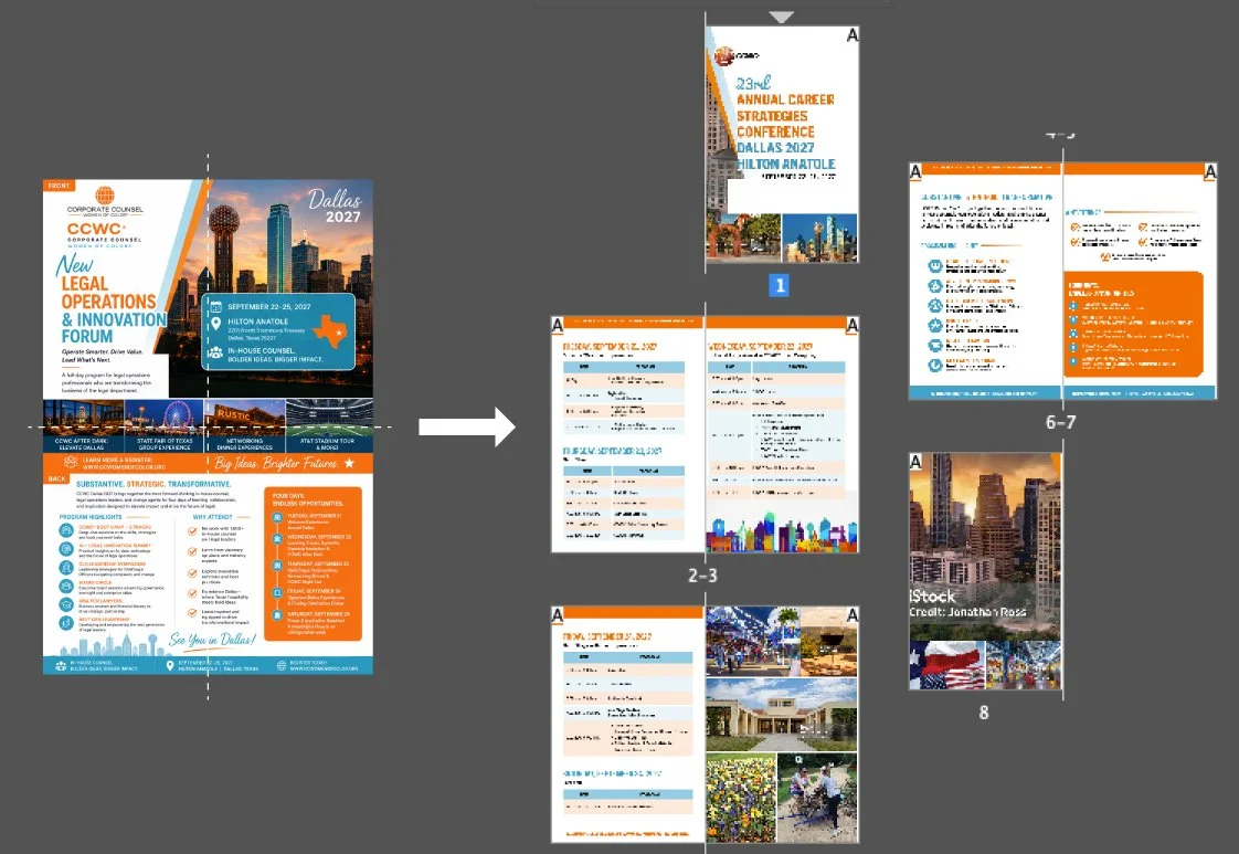
Left: the AI-generated “brochure,” with intended folds shown. Right: the rebuilt eight-page booklet, prepared for print.
She had never been happier with my work.
That experience made me reconsider something designers have been wrestling with long before generative AI entered the picture: sometimes the client just likes what they like. A two-week gig lasted almost four months.
Mustard and Coffee Stains
Years ago, while working on the XX&XX website, research had identified the need for a strong accent color. The new site was a complete overhaul, technologically enhanced, feature-rich, image-heavy and otherwise visually restrained, so it needed a punch of color to establish hierarchy and provide contrast. Our team explored options, iterated, created mockups and tested them, and the color survived the process. The color itself was hardly the thesis of our research or the concept being presented. It was simply an accent color we had landed on and thought, rather safely, was settled.
By the time we presented the final design, the team, client and participating stakeholders had bought into the solution. Then, less than fifteen seconds into the unveiling, a stakeholder who had been too busy to participate throughout the process interrupted.
“I hate that color. It reminds me of mustard, and I loathe mustard.”
Months of process met a condiment.
We recovered. I think I ignored the comment initially, but the presentation was difficult from that moment forward. The color was integrated throughout the design, which meant every subsequent screen carried the evidence of the thing he had just announced he hated.
The frustrating part was that there was no meaningful design argument to have. We could explain why the site needed an accent color, present the research, discuss hierarchy and contrast, and demonstrate how the color functioned throughout the system, but none of that could prove he shouldn’t hate mustard. His objection wasn’t really about design; it was about taste, and expertise has surprisingly little authority over one man’s palette.
Another client, the XforXXX, taught me a related lesson.
For one campaign, our creative brief asked us to explore the intersection of continuing education and networking within the building industry. Our team researched the problem and developed three concepts specifically around those ideas, but none resonated with the stakeholder. Instead, she suggested an image she had found of a coffee stain.
She felt the coffee rings somehow communicated building better business through continuing education, networking and the building industry. When asked why, she explained that the image came from her two-year-old child, who had accidentally put a dirty cup on top of her paperwork. The moment made her feel warm and fuzzy.
I went silent, and she noticed. Excited about the idea, she asked what I thought.
Rolling my eyes, I said, “Of course you would think a coffee stain created by a toddler is the appropriate concept to use for this campaign.”
When Expertise Gets in the Way
There is another uncomfortable side to this: design expertise can become its own obstacle.
Earlier in my career, I was more comfortable treating aesthetic judgment itself as part of what a designer brought to the table. Of course we worked on behalf of others, solved communications problems, responded to business needs and operated within constraints, but I did not feel the same obligation to turn every visual decision into a proposition I could defend with evidence. We are commissioned artists, after all.
As UX became a more dominant influence on my work, research, testing, accessibility, behavioral evidence and measurable outcomes gave me a more sophisticated vocabulary for explaining decisions. If someone asked why, I had an answer: research told us this, testing demonstrated that, accessibility required this, and users behaved that way.
That was progress, but somewhere along the way, I wonder if I also became convinced that every design decision had to win an argument.
I certainly behaved as though it did.
I once went head-to-head with a client who insisted on white type over a background that was simply too light to support it. The piece had to go to print before the end of the day, and it was approximately 4:30 on a Friday. I knew the contrast didn’t work, explained why and, when the client still wanted it, explained again.
Eventually, in exasperation, I asked if the client was color blind.
The client was a Black woman. I was thinking only about contrast, without considering how the question might sound in that context. Whatever point I intended to make about legibility, asking whether she was color blind was a dismissive way to make it, and my intent did not excuse it.
Beneath that frustration, and my absolute indifference to how my words landed, was a fierce defense of the director’s chair. It is a tension many designers recognize: I know this doesn’t work, so why are you paying me for my expertise if you are going to ask me to deliberately ignore it?
When I know something is wrong, I want to fix it, and when I know something can be better, I want to make it better. Hell, it’s my slogan: “Making Good Things Better.”
Sometimes that has meant doing extra work simply to demonstrate why the client should let me do the work they hired me to do. The problem is that many clients don’t particularly want to be educated in the design process, another principle exhaustively taught to me by my alma mater.
Clients just want their thing.

Warm and fuzzy thing. Image generated by the author using AI.
Then AI Made the Thing
This is why generative AI’s entrance into the client-designer relationship is a mechanical shift rather than a debate over whether AI produces good or bad design.
Clients have always had taste, rejected well-supported creative decisions because they simply didn’t like them, and found random images they wanted designers to “do something like.” They have always arrived with highly personal associations that bear little relationship to the communications strategy. What has changed is their ability to visualize those preferences.
Creatives have always had habits of our own. Even at a top, world-class ad agency I worked at, managing directors disparaged the work a client had chosen, even after our team had faithfully recreated it. The client was a company worth well over $100 million, and its account was worth millions to the agency, yet its taste was looked down upon to the detriment of my hard-working team.
The XX&XX stakeholder could tell us he hated mustard, and the XforXXX stakeholder could have produced anything that made her think of her child. Today, either of them could keep generating images until the machine gave them something that produced the feeling they were looking for, then hand it to a designer and say, “This.”
The designer’s instinct is to correct it. But there are really four kinds of objections a designer can have. Something can fail functionally: people can’t read the text, the navigation can’t be understood, the document can’t be printed as intended. Something can fail to communicate: the image means something to the client and nothing to the audience. Something can misrepresent: the imagery infringes on someone’s rights, or shows a place, product or person that doesn’t exist. Or something can simply violate the designer’s taste. The first three are problems the designer is paid to solve. The fourth is not.
If the client loves a visual aesthetic, and it can serve the purpose for which it is intended, that may not be a problem at all.
That may simply be mustard.
The Slop Is the Brief
With the AI-generated brochure, the workflow changed. There was no need to convince the client to like an idea because she had already shown what she liked. Her aesthetic preference was clear before the process began, and the job was no longer to persuade her that it should look different, but to make it work.
This changed where my energy went. The concepting and aesthetic persuasion that had occupied so much of my process were largely gone. What remained was the work of understanding what she was responding to, preserving it, and figuring out how to make the thing real.
I needed to determine the actual size of the document, where she would have it printed, how it would fold and what the page sequence needed to be. I needed to establish the gutters, resolve anything crossing a fold and determine what would happen when the images had to be reproduced at print resolution. Beyond the immediate printing requirements, I needed to make sure somebody could edit the document later, the client could reuse it, and another designer could open it.
Could this thing survive the transition from an image that looked finished to an object that actually was finished?
Those are questions of craft. AI had not taken the design process away. In this instance, it removed one of the components of that process that had historically been the hardest, most heart-revealing part for me. Developing a concept was like giving birth to a child: I had created something, believed in it and then had to persuade someone that a designer’s aesthetic judgment should supersede their own. And in the process of deliberating every junction point of feasibility, I realized there was so much more to what I do than making “pretty pictures.”
This does not mean every decision in the AI-generated image deserves to survive, or that the finish of the brochure is a matter of indifference. It means preserving what the client is responding to while addressing the structural elements that would prevent them from using it. The client has effectively said, “Here is my taste,” and that asset becomes the data footprint for the project.
It may also reveal something we have not always been particularly good at asking: what kind of client does the client want to be? Some clients want us to originate the concept, challenge their assumptions and occupy the director’s chair. Others want a greater claim on that chair themselves. They want to direct, even if they have historically lacked the tools or visual vocabulary to show us precisely what they mean. Generative AI gives them that ability.
Maybe clients have been trying to tell me that for years. AI was simply the first tool that allowed one to show me.
The Return of Craftsmanship
Earlier this year, I wrote an article called The Case for Reviving Craftsmanship in the AI Era. My argument was that AI isn’t killing creativity so much as exposing how our industry undervalued execution. When surface-level production becomes cheap, what rises in value is what AI can’t easily fake: structure, precision and finish. I drew a line between an image and an asset, and argued that work isn’t done until it produces something a real team can open, edit and build on.

Cover image of The Case for Reviving Craftsmanship in the AI Era.
I also argued for a clearer division between conceptual roles and craft roles, without a hierarchy between them. Directors direct. Craftsmen craft.
At the time, that was largely a proposition about where I thought design was heading. I didn’t expect to test it on myself. Then a client handed me a 9.34-by-12-inch AI-generated posterchure. The concept already existed, the client already loved it, and what remained was everything the image didn’t know. She and the machine had taken the director’s chair. The craft seat was mine, and it was a better seat than I expected.
Looking back at mustard, the coffee stain and a Friday afternoon at 4:30, I can see that some of what I once defended as expertise was really a claim on the director’s chair. I wasn’t only fighting for the work. Sometimes I was also fighting to be the one who decided what it looked like.
Perhaps the next era of design expertise will require some humility from designers as well. Expertise isn’t always knowing what something should look like, winning the argument or convincing every client to share our taste; sometimes it means recognizing which battles matter, distinguishing an aesthetic preference from a failure of communication or function, and understanding what someone is responding to even when they cannot articulate it themselves.
And sometimes it means taking something you would never have designed, preserving precisely what someone loves about it, and using everything you know to make it real.